Snake Oil – The Sequel
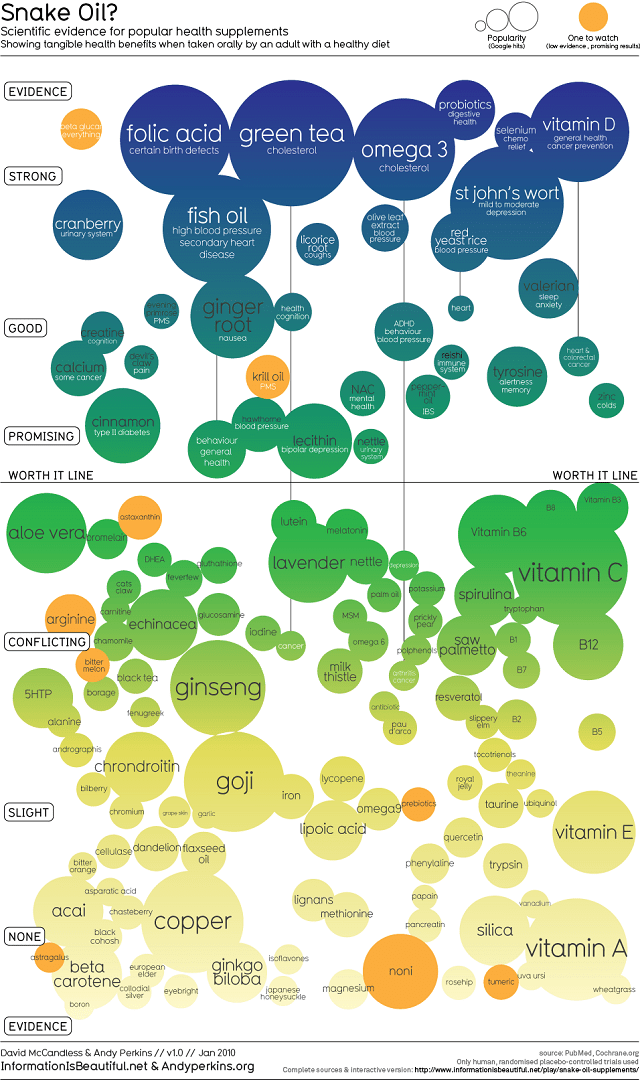
A few days back I posted about all the “healers” out there just waiting to take advantage of people struggling through health issues. Coincidentally, I found this amazing and useful infographic. It looks fairly simple, but it took many hours of research to create it, and it is, to my knowledge, the best resource about the actual efficiency of various dietary supplements out there. From the author:
“This image is a “balloon race”. The higher a bubble, the greater the evidence for its effectiveness. But the supplements are only effective for the conditions listed inside the bubble.”
The graphic shows the effectiveness of health supplements on the Y-axis (higher is better), and uses the size of the bubbles to illustrate the popularity of that particular supplement among adults. Anything below the “worth it line,” doesn’t have enough evidence of medicinal benefit and is probably not worth your time, according to the graphic’s creators, who looked at data from over 1500 studies. The infographic effectively combines data on both popularity and medical benefits to create a resource that points out the best health supplements, as well as which ones consumers believe in the most.
–
Pretty cool, interesting & informative, I’ve never been a big vitamin guy but I have been pounding back the Omegas….. that’s it for today folks, not feeling very tip top, will explain tomorrow.
Have a Great Day.
